


Product Screen & Profile Drawer Redesign
Redesign eBay’s Mobile “Product Description Page” Screen and Profile Drawer
iOS
iOS

Introduction
Тhe current iOS design is well thought out, but not without its flaws - it definitely needs some polishing, an improved structure, and greater simplicity in order to create a better user experience. Although I did not focus on animation in this exercise, I think that it plays a key part in modern design. Let's focus on the elements of UI/UX design for product card.

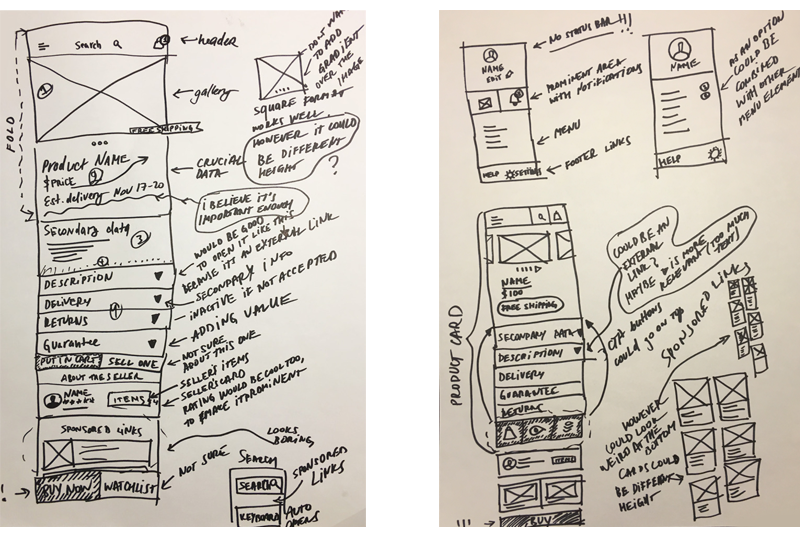
Sketching the ideas
I started working on the project by sketching out the current version and mixing it with my ideas. I decided to break the entire layout into three parts:
• Product card
• User card
• Sponsored links
• User card
• Sponsored links
I decided to create a generic product card resembling a user profile on social networks (e.g. Instagram) with an image, text, and CTA buttons.
As you can see from the drafts below I have prioritized the content elements in each section and tried to come up with the proper order of the blocks.
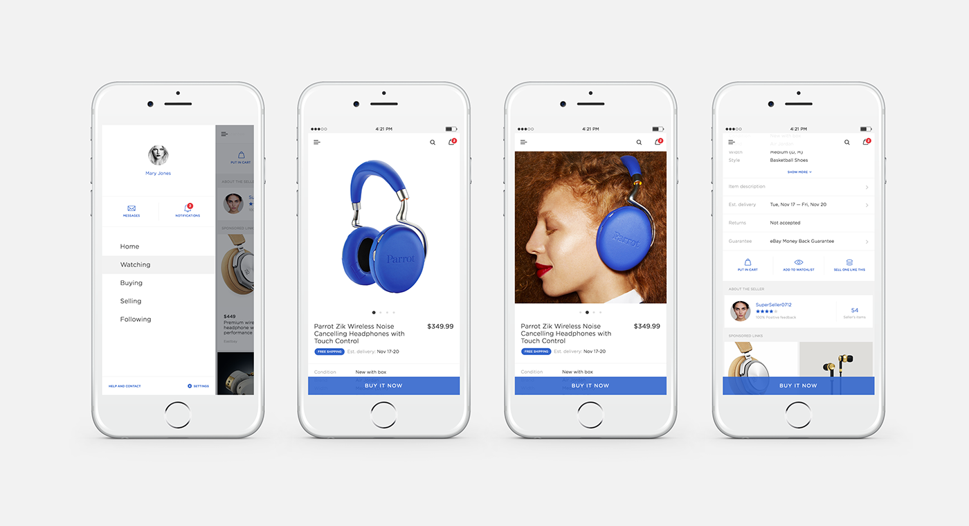
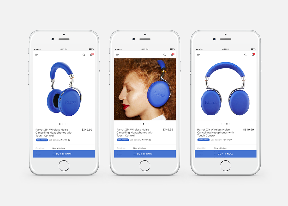
The main element of the product card is the image and, that is's why I decided to increase the height and make it a square format. I have also redesigned the other most important section of the card, – namely the section with the product name, price, and delivery information. All additional information is considered secondary, and it has been placed below the other elements.
I decided to put the "Add to watchlist" button together with "Add to card" and "Sell one like this" buttons in order to put the main emphasis on the "Buy it now" button at the bottom.It is still uncertain whether the "Sell one like this" button should be included on this screen, but most likely it will remain here since it has proven itself a necessary and clickable element. Making the "Add to watchlist" button less important on the screen could affect engagement, though (needs testing). We can also add "Share the item" here. I have added the icons to highlight each button's mission and sense.
I came up with the user card that represents a seller but there could be another card for a buyer as well. I have also added "rating", which is a more prominent version of the user's feedback. It could potentially make sellers work even harder on improving their rating. As for users, it is easier to catch their attention with stars rather than words. Potentially, a user card can have even more CTA buttons (Follow the seller, Ask seller a question, for instance).
The key element of the product card is a CTA button which, in this case, is "Buy it now" - it's sticky and floats at the bottom of the screen.

Look and feel
I have used the blue color from the brand's identity. It is the main accent color on the screen (same in the current version). The sans-serif font used works well in conveying polished look and feel. I propose to use a lot of white space together with the light font, and I break the sections with the light gray color. The app has to feel premium and user-friendly.


Product card
As you can see from the design below, I came up with thin and simple icons. I created a blue tag for the "Free Shipping" option (which is a snippet of the full shipping information below).
For the "Sponsored Links" section, I came up with a two-column grid of the large product images so that it doesn't look blend as in the current version. It was very important to make sponsored links look like they are native to the design.


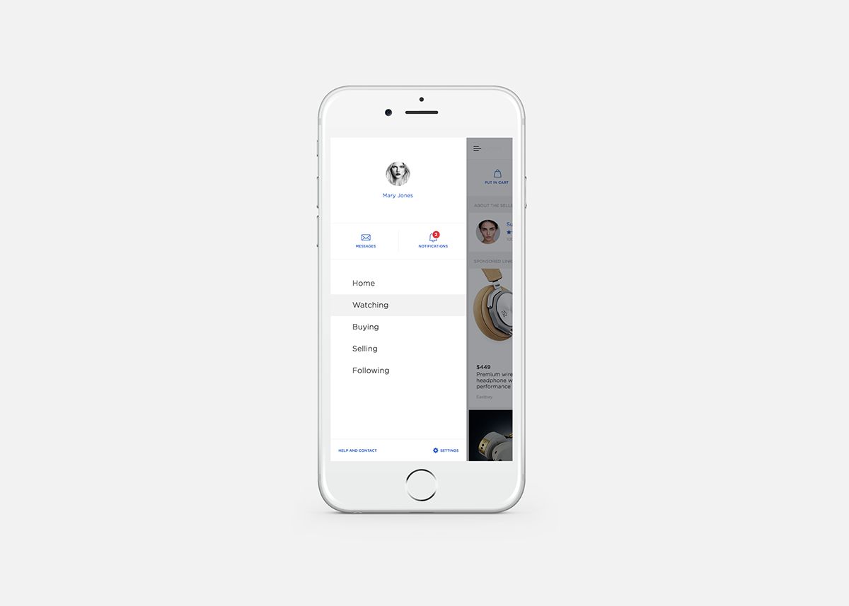
Drawer profile
I like the way this screen looks in the current version of the app except for the look of it. I have added an icon to the "Settings" to distinguish it (the icon is solid because it is small size). Basically, there would be two sets of icons: big/outlined and small/solid. As an option, we could add an "Edit Profile" link below the user's name.
I have used a red color because users consider it to be the color of notifications and it is in eBay's brand identity (there is a room for using green and yellow as well). The text below the icons probably looks small, but words are not the main elements, they just support and complement the icons.
Below you can see the refinements I came up with and the way I envision this screen.
Thank you for your time.


